LDF Hair Clinic
LDF Hair Clinic
Brand Identity
Web
Production
Art Direction
A new aesthetic language for LDF Hair Clinic, where medical precision meets empathy
The project began with a reflection on self-esteem.
Not as a simple clinical outcome, but as a deeply personal journey, one that involves perception, confidence and the relationship people have with themselves.
The new identity translates this vision into a fluid visual language, where technology and empathy coexist in natural balance.
At the center of the system is an abstract shape that becomes a path: a symbol of growth and continuity. Light forms, three-dimensional surfaces and subtle motion define the brand and digital presence, creating an atmosphere that feels sensory, precise and emotionally resonant.
Alongside the 3D visuals, real photography, clinical details and authentic portraits bring the individual back into focus. This constant dialogue between scientific authority and human connection allows the identity to feel both credible and intimate.
The result is a sophisticated and contemporary brand system that communicates precision, discretion and clarity, while remaining deeply centered on the individual.
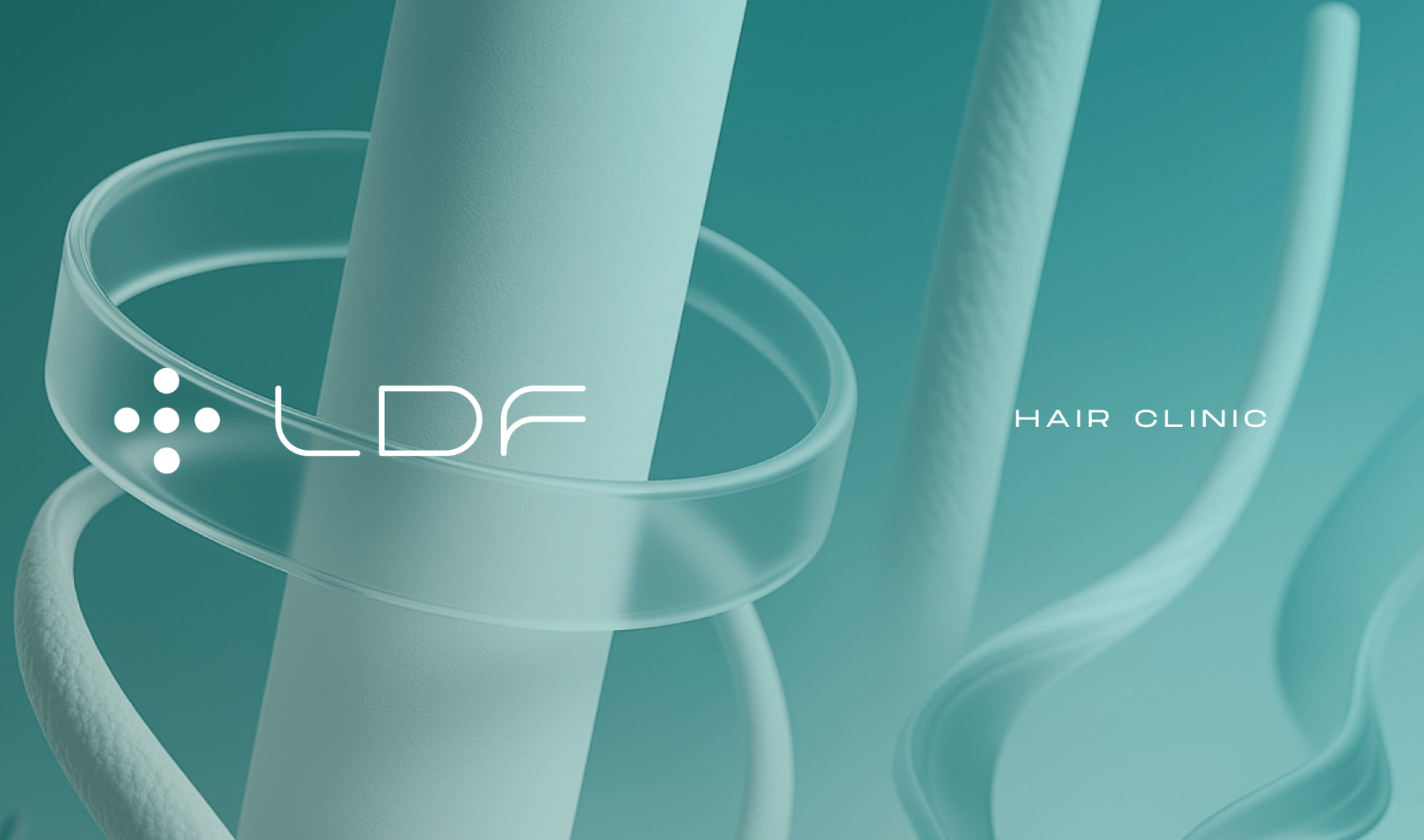
A new visual language
The LDF rebranding was born from the desire to move beyond the conventional visual codes of the hair clinic industry, often dominated by technical, medical or purely results-driven communication.
The logo is conceived as a custom line-based typeface: a continuous visual gesture that suggests growth, transformation and care. Its fluid forms reflect the smoothness of the process and the warmer side of the brand.
The new identity feels personal, international and contemporary. It expresses innovation without losing warmth, and authority without becoming distant.
Its tone of voice is scientific yet accessible, discreet yet memorable — creating a sophisticated presence that is both calm and immediately recognizable.
Between science and perception
Every element of the project is designed to balance clinical expertise with emotional perception.
Color, typography, motion and composition work together to create a sense of calm, control and quiet confidence. The visual system avoids over-explaining, choosing instead to build trust through atmosphere, clarity and sensitivity.
The 3D reconstructions abstract hair into a fluid and immersive visual matter, expressing the idea of regrowth in a more emotional and less didactic way.
This creates a language that begins to establish confidence even before the technical explanation starts.
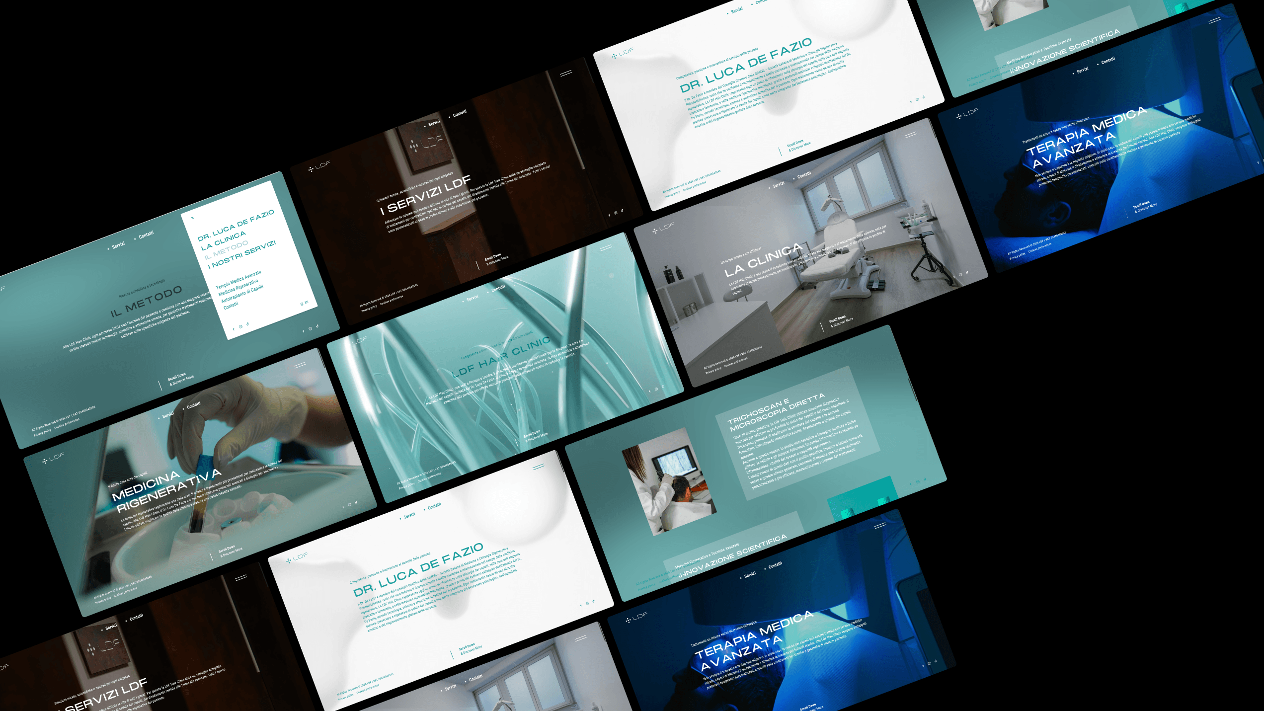
Immersive clarity in the digital experience
The website was designed to translate the outstanding expertise of Dr. Luca De Fazio and his team, together with the clinic’s highly personalized approach to care, into a clear, intuitive and engaging digital experience.
Clinical information, treatments and insights are organized through a thoughtful content architecture, guiding users through a seamless navigation path that never feels overwhelming.
Each piece of content, together with the immersive quality of the 3D visuals, was developed not only to present services and treatments, but to build an atmosphere aligned with the clinic’s vision.
More Projects
Discover all the projects and meet all the clients who chose Studiogusto to reach their goals.
All Projects