Food Beyond Matter
Rebis
Art Direction
Brand Identity
Production
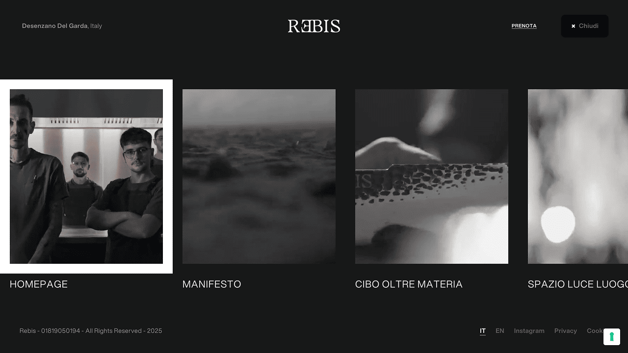
Web
Social Media Management
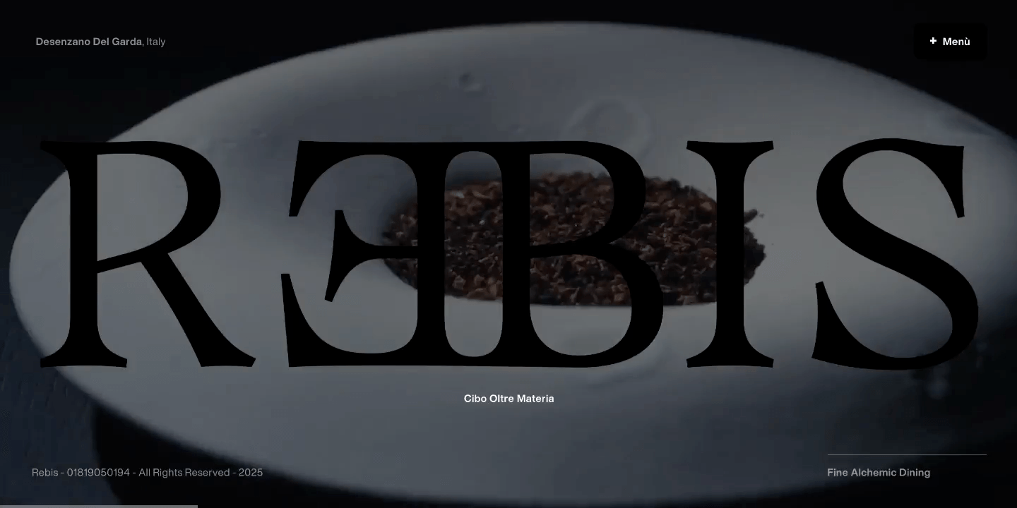
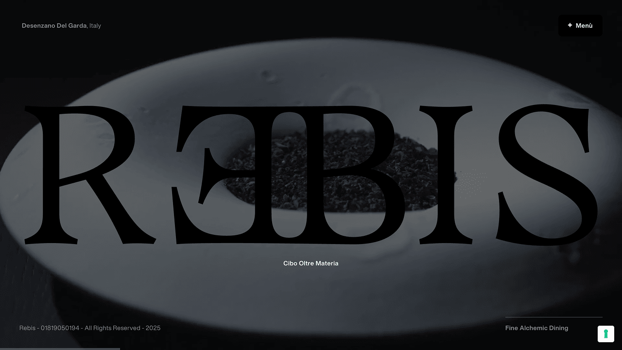
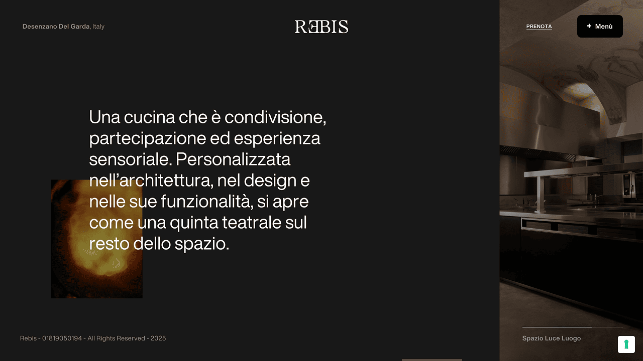
Fine Alchemic Dining
Alchemy, as a quest and transformation, guides the pairing of elements — on the plate and in the sensory space — letting connections emerge and evolve through the experience.
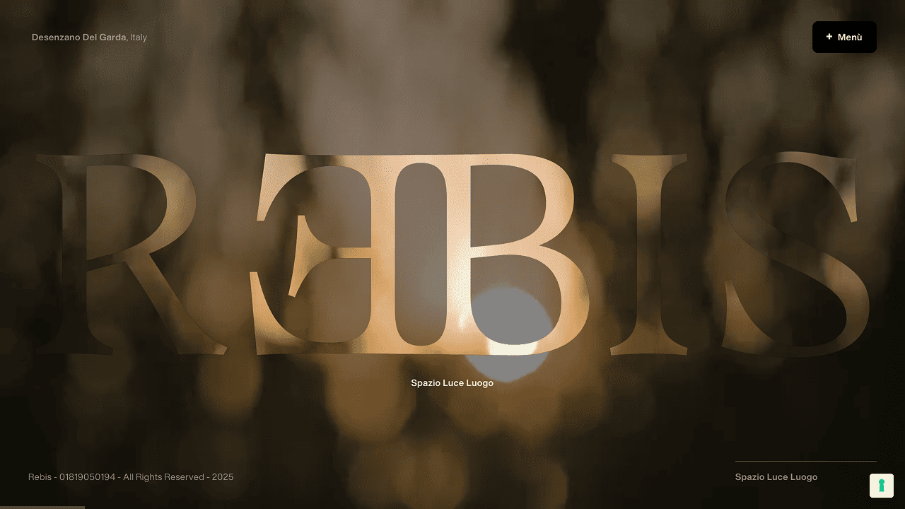
A single language was shaped to hold REBIS together: not as a set of assets, but as a world expressed through form, rhythm, and symbol — where typography and illustration become a quiet thread across every surface.
The digital experience, the menu conceived as an editorial object, and the moving image extend the same vision: a narrative made of rituals and fragments, revealed over time with intention and restraint.
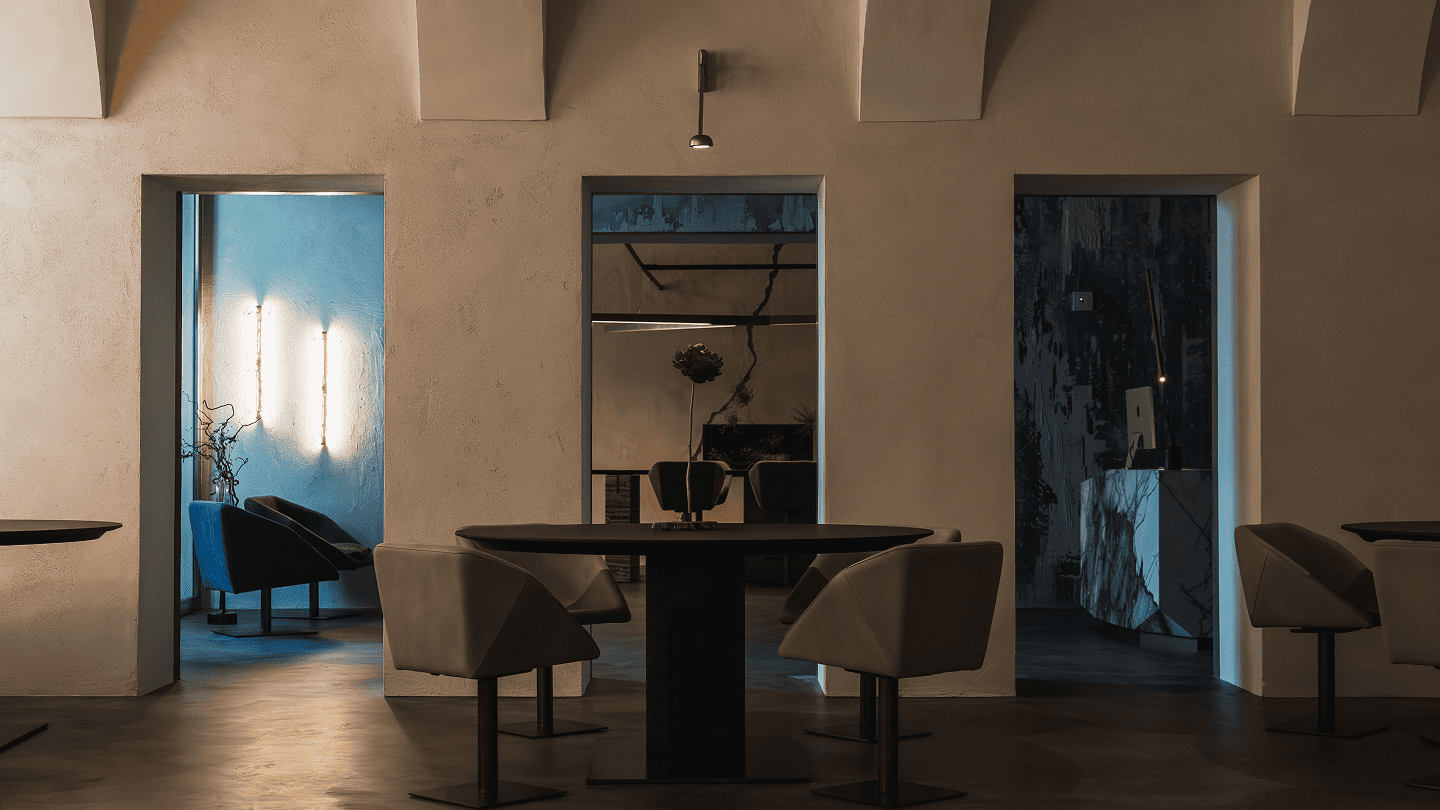
From Symbol to Surface
A symbolic grammar holds the experience together - where opposites meet, meanings shift, and every element gains depth through relation. The identity is conceived as an open system, designed to carry the same world across different surfaces without losing its mystery.
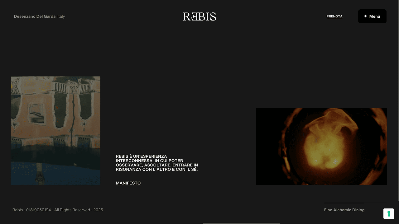
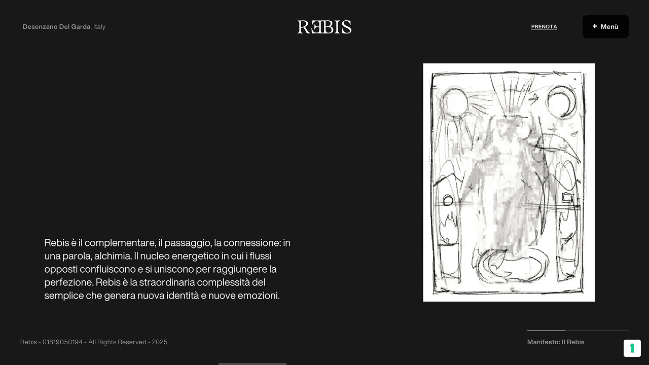
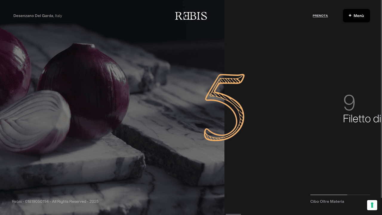
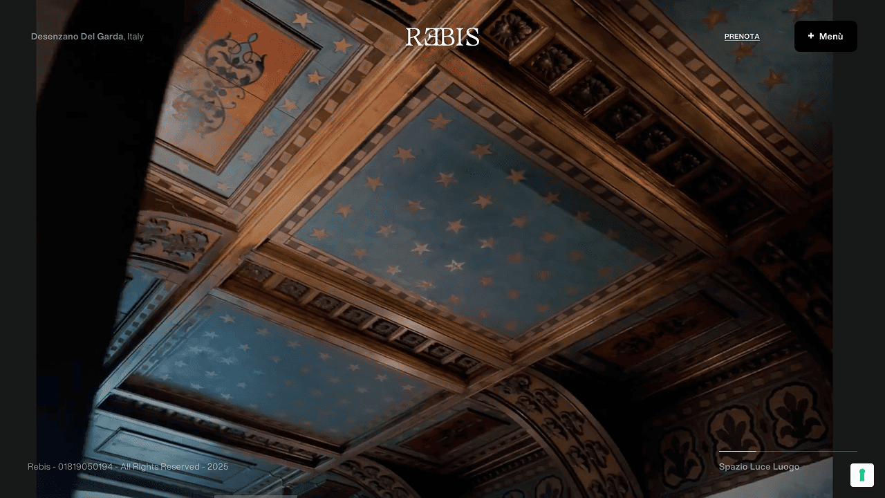
The website becomes a threshold: spare in structure, deliberate in pace, built around the manifesto voice and a sense of progression. Language and layout guide the visitor from element to element, letting the concept unfold rather than be explained.
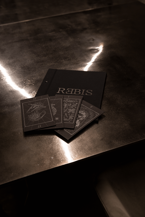
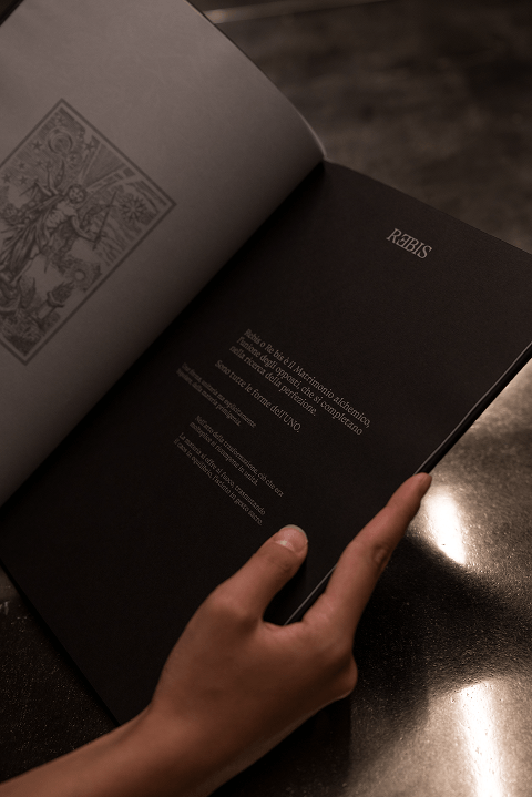
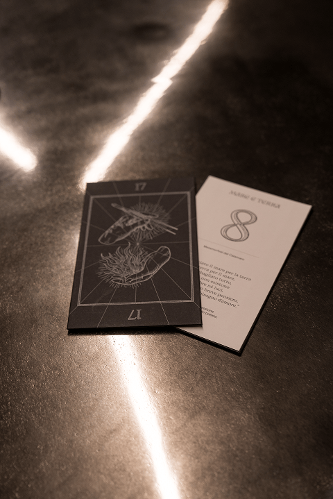
The menu translates this vision into an editorial object: a card-based format conceived as a deck to be handled, discovered, and recomposed. Typography and illustration extend the same symbolic language, turning reading into part of the ritual — tactile, intimate, and restrained.
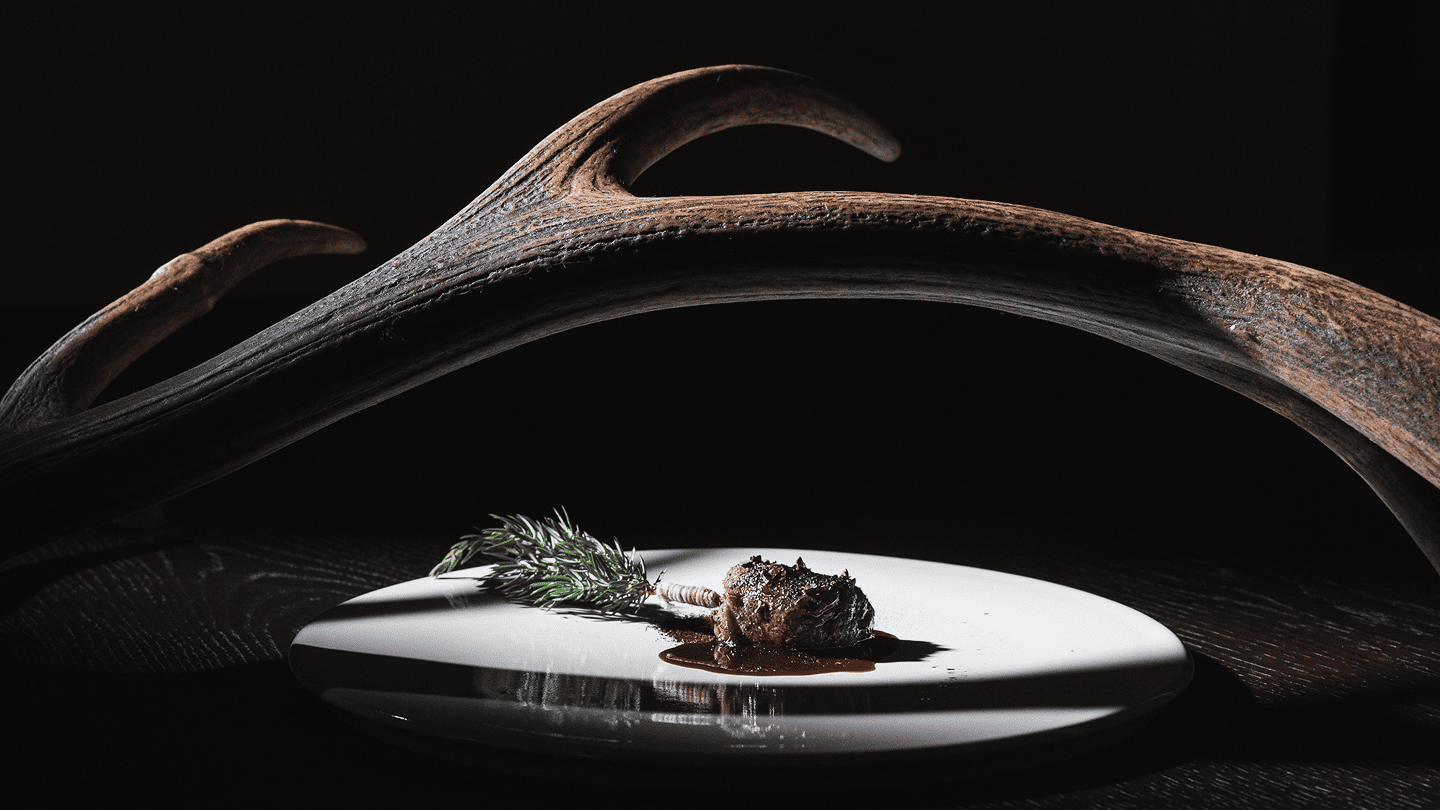
Ritual in Light
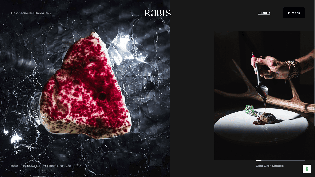
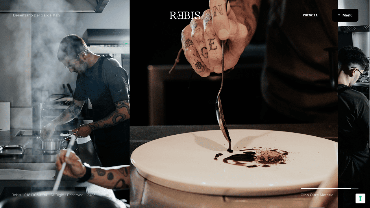
Photography became the primary vessel of the language — not to catalogue dishes, but to shape a world through light, texture, and controlled tension. The images privilege stillness and precision: fragments, shadows, and material presence, where the plate reads as a symbol as much as a course.
Video extends the same sensibility into time, preserving the photographic discipline in pacing and framing. A visual grammar built on contrast and restraint — able to move between cinematic sequences and vertical cuts without losing atmosphere or turning the experience into display.
An Editorial Cadence
The social editorial plan was designed as a long-form narrative — a sequence of chapters rather than isolated posts — where meaning is revealed through rhythm, recurrence, and variation.
Content is organised into thematic lines that return over time, allowing the brand’s symbolic language to remain recognisable while constantly shifting in focus. A system built to sustain presence with consistency, and to let the story evolve without losing its thread.

More Projects
Discover all the projects and meet all the clients who chose Studiogusto to reach their goals.
All Projects