Michelangelus
Fabbrica di San Pietro
Art Direction
Typeface Design
Visual Research
From the handwriting of a master to a contemporary typeface.
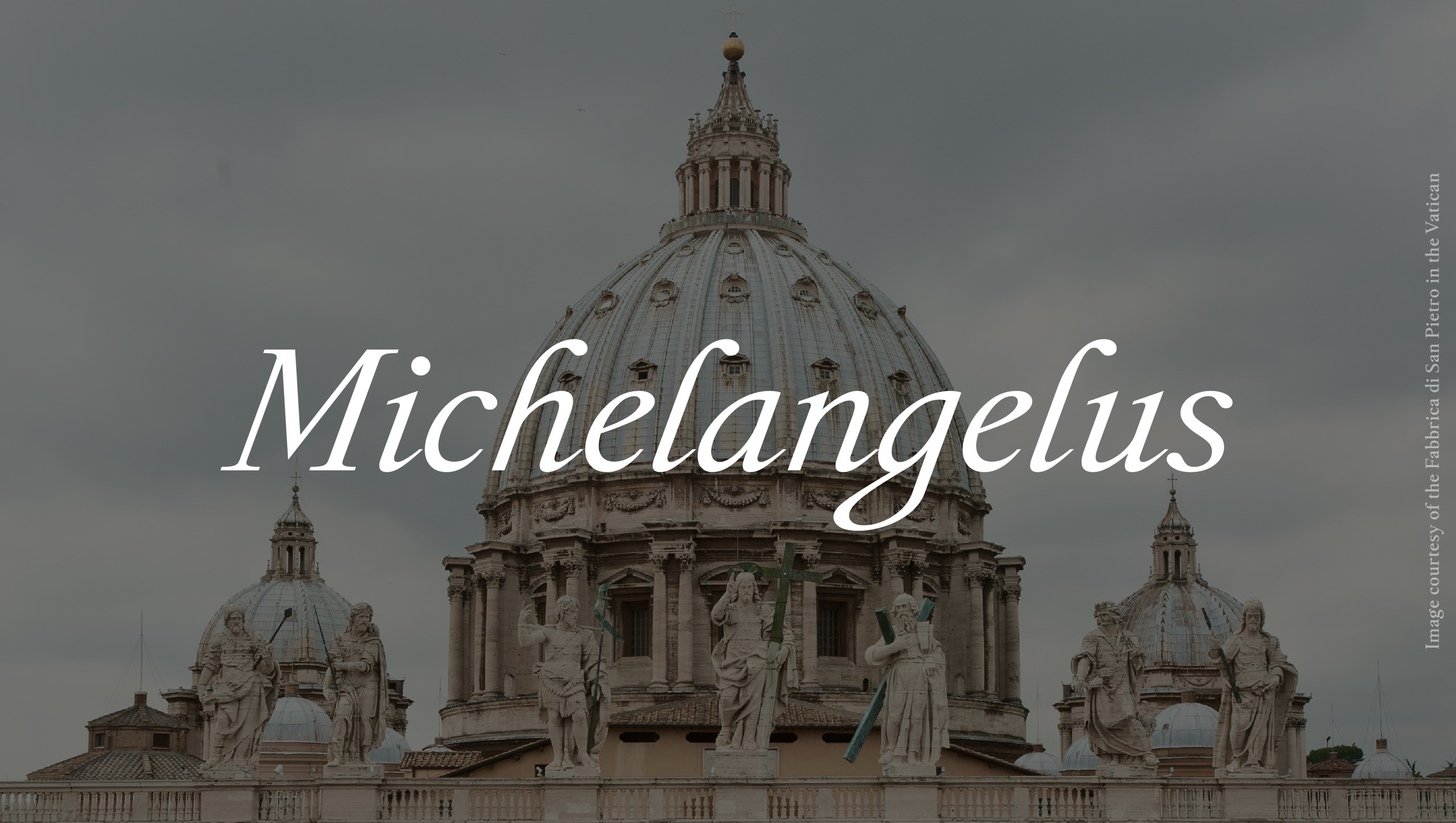
Michelangelus is a typeface designed by studiogusto® for the Fabbrica di San Pietro in Vaticano, inspired by the original handwriting of Michelangelo Buonarroti and developed in collaboration with Microsoft.
The project brings together historical research, typographic design and digital innovation, transforming the distinctive features of the Renaissance master's handwriting into a contemporary visual language.
More than a digital reproduction of historical letterforms, Michelangelus is an interpretation of Michelangelo's graphic expression, conceived to preserve its character while making it accessible and functional across modern communication environments.
Exploring the handwriting of Michelangelo.
The design process began with extensive historical and visual research into Michelangelo's original manuscripts, drawings and correspondence, drawing on hundreds of documents preserved in the archives of the Fabbrica di San Pietro, the Vatican and Casa Buonarroti.
These materials offered an intimate perspective on the master's relationship with writing: a spontaneous and expressive gesture, shaped by the tools, materials and habits of his time. Through the analysis of recurring letterforms, proportions, inclinations and rhythms, our team identified the distinctive elements that could become the foundation of a new typographic system.
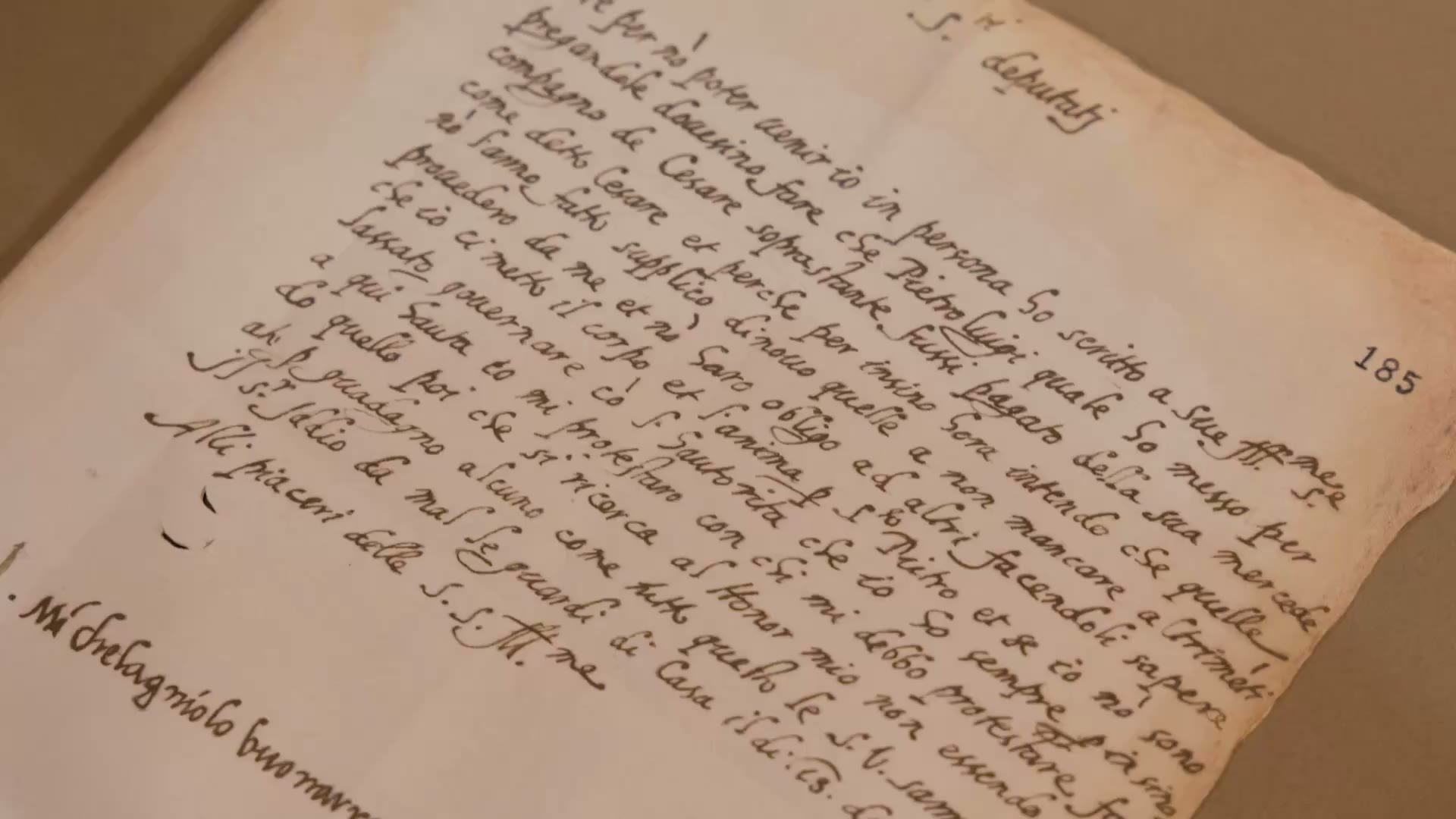
Interpreting, not imitating. Translating handwriting into type design.
The transition from historical handwriting to contemporary typography required a process of interpretation and synthesis.
Starting from the original forms, we explored the relationship between expressive irregularities and recurring structures, identifying which characteristics to preserve, reinterpret or simplify.
Initial sketches were developed by hand, allowing us to investigate the movement, construction and proportions of individual characters before translating them into digital outlines.
Each letter was then progressively refined to establish a coherent relationship with the others, balancing the authenticity of the original gesture with the consistency and legibility required of a contemporary typeface. The result is a visual language that retains the expressive qualities of Michelangelo's handwriting without becoming a literal imitation.
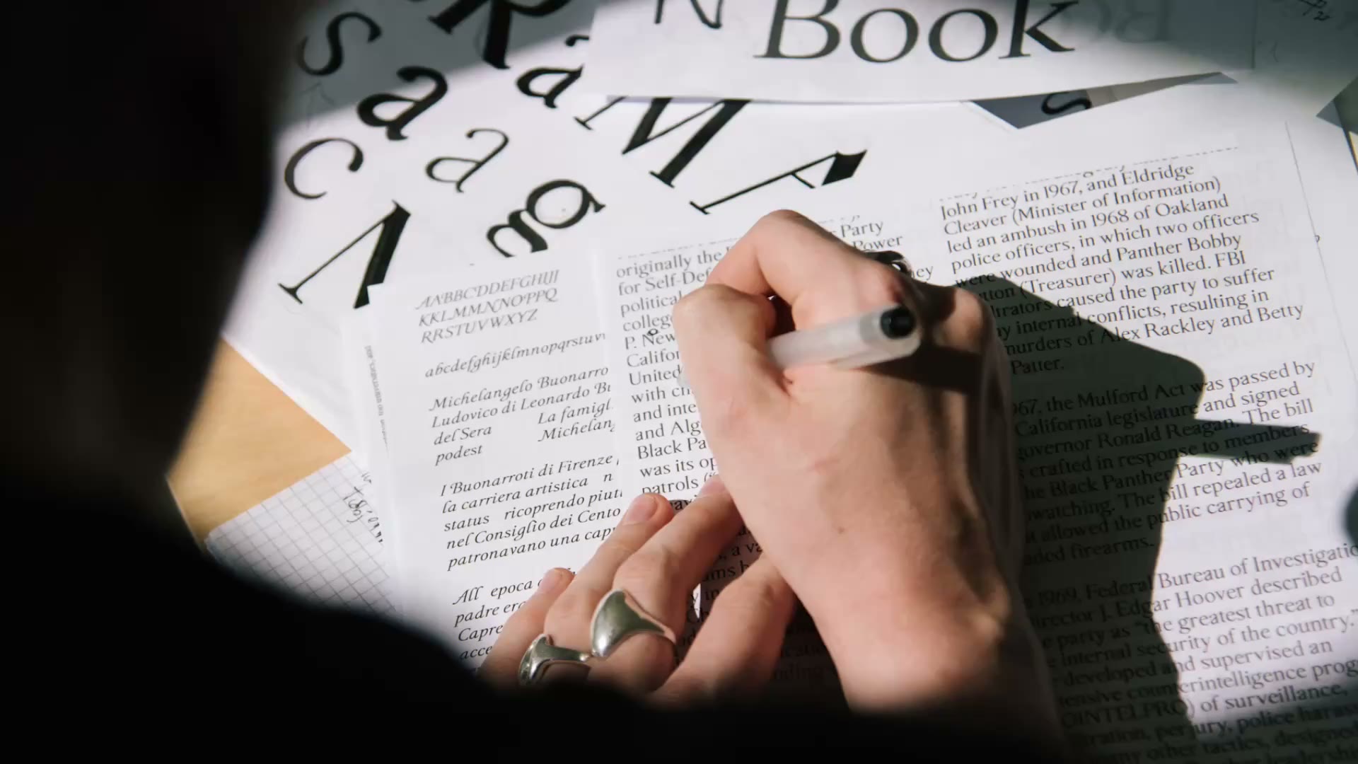
A complete typographic system. Over 500 glyphs, four styles, one distinctive character.
The development of Michelangelus extended beyond the design of individual letters to the construction of a complete and versatile type family. With over 500 glyphs and four styles - Regular, Bold, Italic and Bold Italic - the typeface combines historical inspiration with the functional requirements of contemporary typography.
Particular attention was dedicated to the relationships between characters, the balance of proportions, spacing, rhythm and readability.

Each stylistic variation was designed to maintain a consistent typographic character while responding to different visual and communication needs. From the expressiveness of a single word to the composition of an entire text, Michelangelus brings the personality of its historical inspiration into a flexible and contemporary design system.
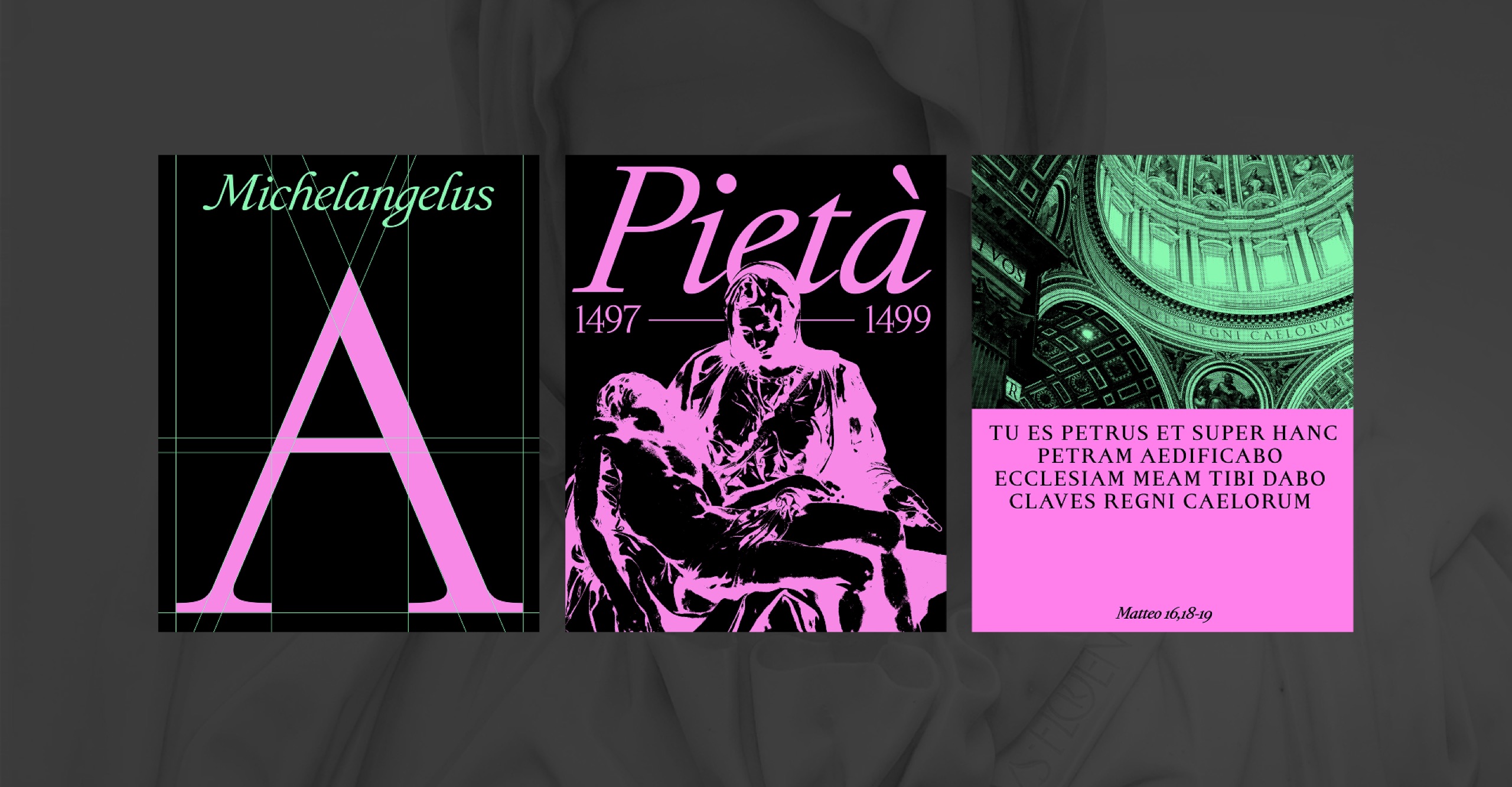
Where heritage meets technology. A design dialogue with Microsoft.
Following the development of the typeface, studiogusto® worked directly with Microsoft's specialists on a series of technical tests and refinements, focused on ensuring compatibility with the high requirements of contemporary digital applications.
The inclusion of Michelangelus in the Microsoft Office font ecosystem represents the outcome of this shared process, connecting a remarkable expression of Renaissance heritage with the tools of everyday communication.
More Projects
Discover all the projects and meet all the clients who chose Studiogusto to reach their goals.
All Projects